VIQTORY
A new fresh look for a military marketing company’s modern set of capabilities.
About Victory Media/VIQTORY
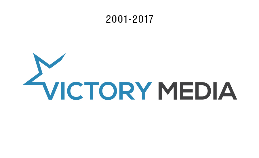
Founded in 2001 by three Navy veterans, Victory Media is well known for their print magazines, military websites and ratings program. I joined the company in 2012 and helped create content and redesign their brands (G.I. Jobs, Military Spouse and Military Friendly.) Our goal has always been to provide opportunities for military families through education, employment, help with franchising opportunities and lifestyle resources.
In 2018 we decided to rebrand the agency to “VIQTORY.”
Campaign Objectives
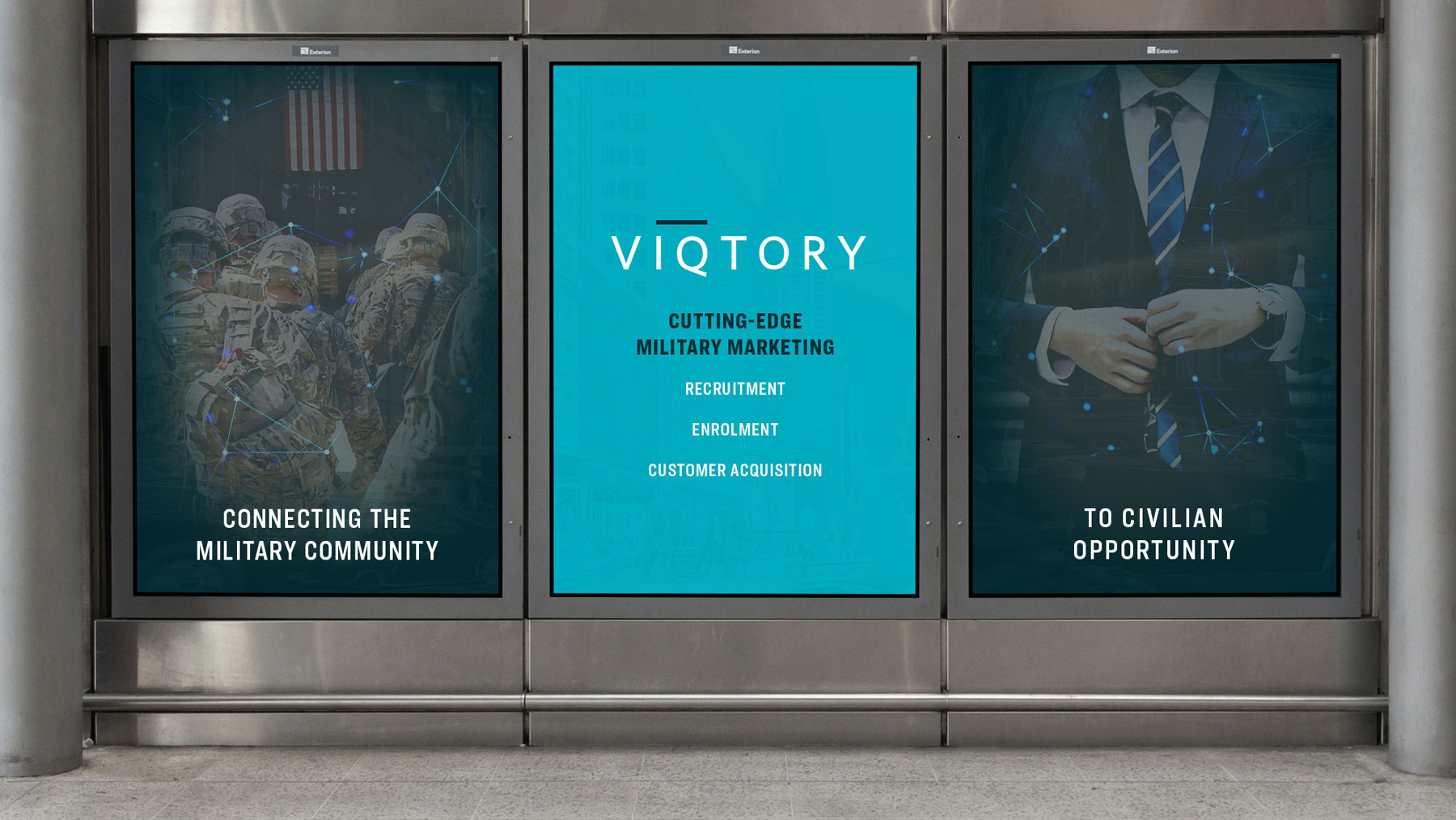
Why did we make that choice? Victory Media’s expertise in digital media, advertising technology and data utilization have evolved over the last several years. And at the same time, the lines between media, agency and technology companies have blurred. The company has leveraged these new capabilities to create efficiency in intelligently connecting the military community to civilian opportunity through its extensive digital and physical media infrastructure. The name change — emphasizing that IQ — accurately reflects VIQTORY’s current capabilities.
Below you will discover more behind the meaning of the name change. I was the creative lead for the rebranding for this project. Edgar Reynolds (Art Director) was the project lead on the website development. Mike Asper (Associate Art Director) assisted with the programmatic ad campaigns for the rebranding (not featured in this case study).
Case Study Components
Art Direction, Branding, Web Design, Print CollateralType of Work
Agency - VIQTORYTeam
Joe Maiocco (Lead Art Director), Edgar Reynolds (Art Director), Mike Asper (Associate Art Director), Chris Hale (Chairman), Sean McAlister (President), Christine Bench (HR Manager)Website
viqtory.comLogo Redesign
We decided to eliminate the word “Media,” which had become too narrow in scope. We do offer media, but we didn’t want to be type-cast in just that realm. The “Victory” in our name goes back to the “V” symbol for “Victory” which was popularized by the Greatest Generation of World War II veterans. It was important to preserve that connection to our rich heritage. But “Victory” as a standalone left us with a name that was shared with beer, motorcycles and churches.
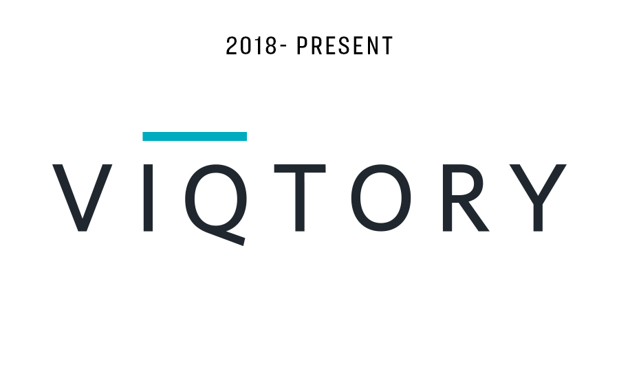
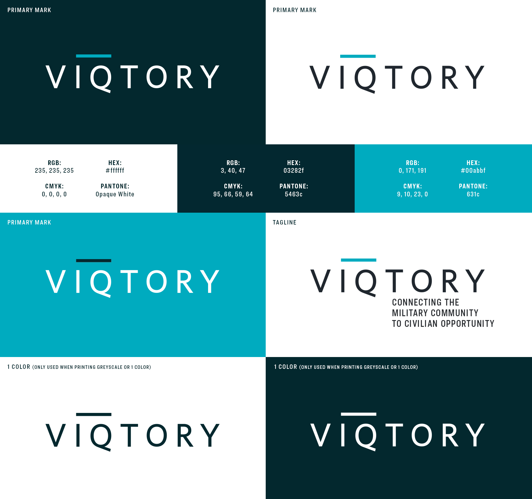
So we decided to use the same root word with the same pronunciation but with a unique spelling. VIQTORY satisfied our goals perfectly. The ‘IQ’ spelling reflects our use of smart data and technology. The wordmark was made by customizing the font “Ringside” by House Industries.
What’s with the line?

The horizontal line is known as a vinculum. A vinculum is placed over a group of terms in a mathematical expression to indicate that they are to be operated on as a single entity. Adding the vinculum shows that the two letters (IQ) are to be connected and to symbolize VIQTORY’S role in intelligently connecting the military and civilian worlds.
Color Palette & Usage
The color palette was created after analyzing several mood boards based on military market competition, social media and first-party data specialists. We wanted to maintain the feeling of being friendly, so we adopted a brighter blue that is more common amongst social media platforms. The darker palette is used within background treatments. This allows us to really allow the imagery treatments to really stand out (which you will see below).
Marketing Visuals
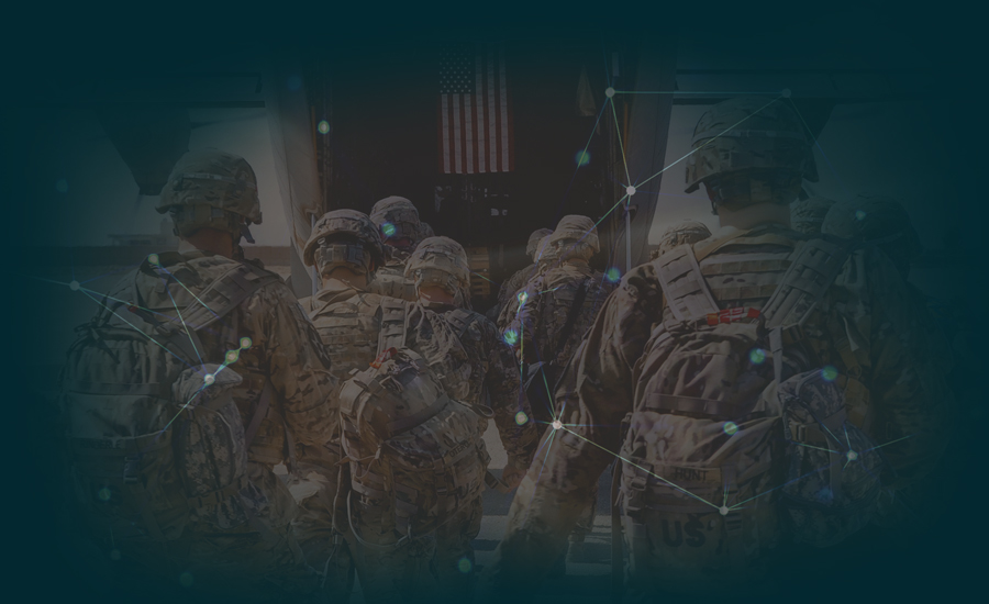
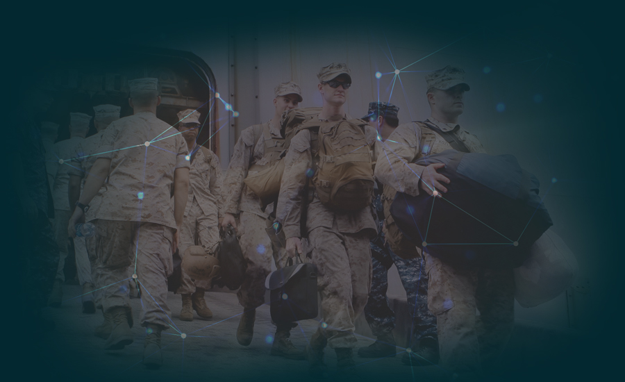
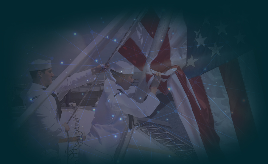
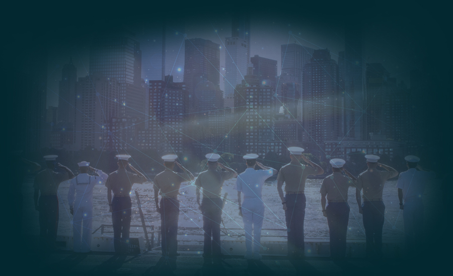
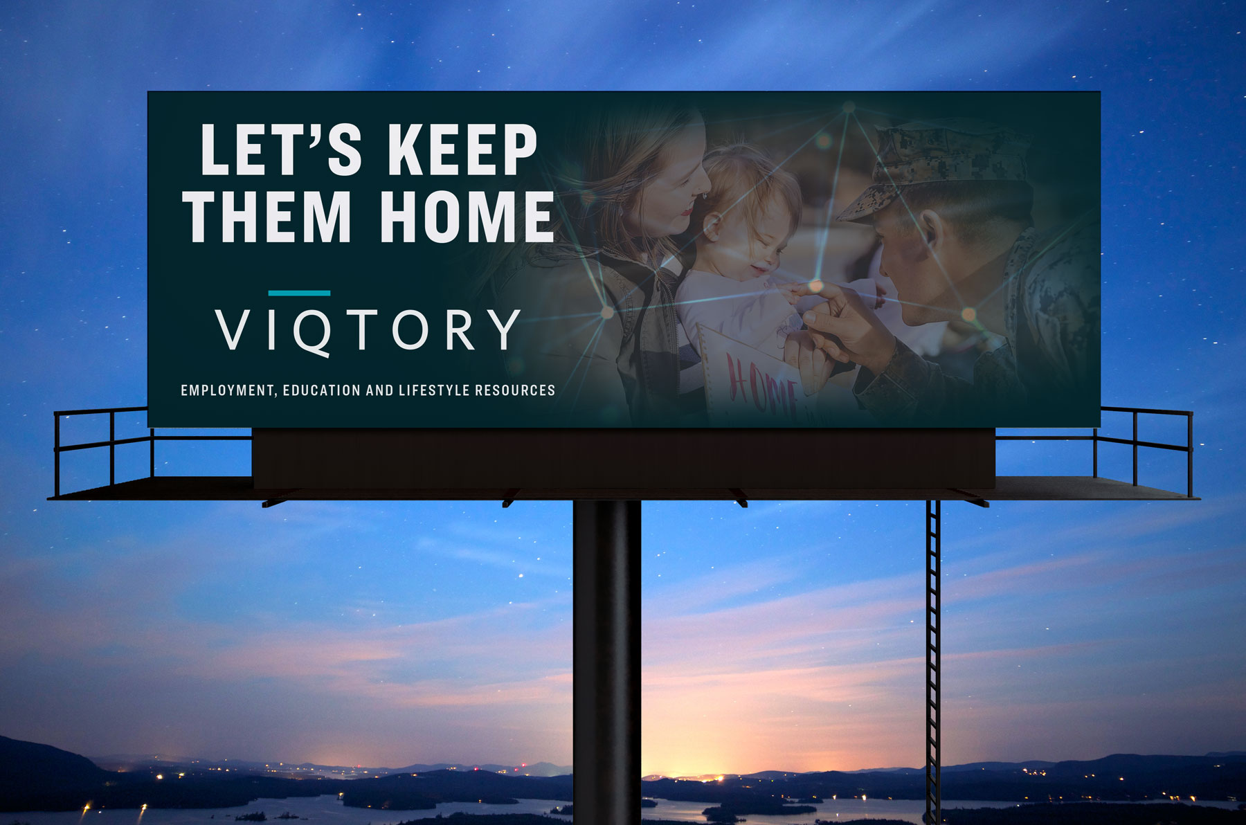
To help showcase our investments into programmatic advertising and enhanced digital technologies, I came up with a campaign involving the merging of data points with our markets. These image plays are used throughout social, print, and programmatic campaigns. I wanted to make sure there was an impactful balance between service member photography and images of military families. It’s important to show how we cover recruitment, education and lifestyle/consumer audiences within the military. Below is a small sample of the imagery that was used.


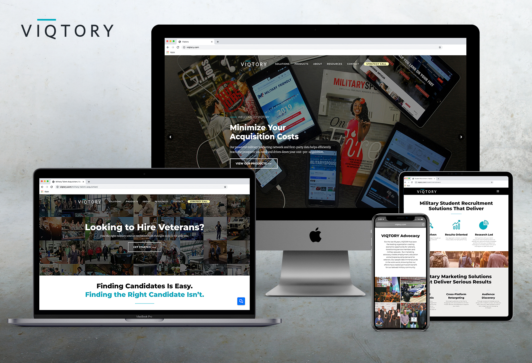
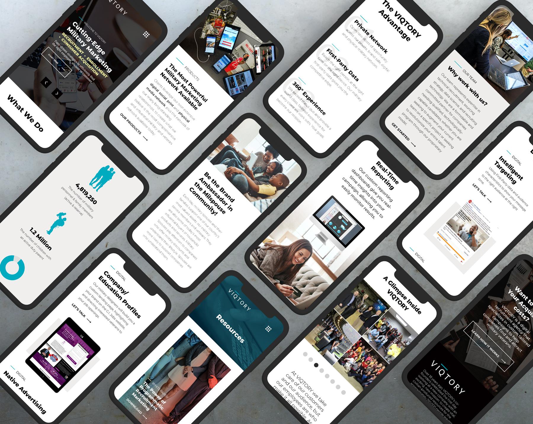
Web Design
The VIQTORY website shifts in focus from heavy military imagery to tech. In the process, we introduce who we are, our solutions, how our products are measurable, our legacy within the military market space and the history of the company. The UI/UX was first designed in Adobe XD and then handed over to the web development team.
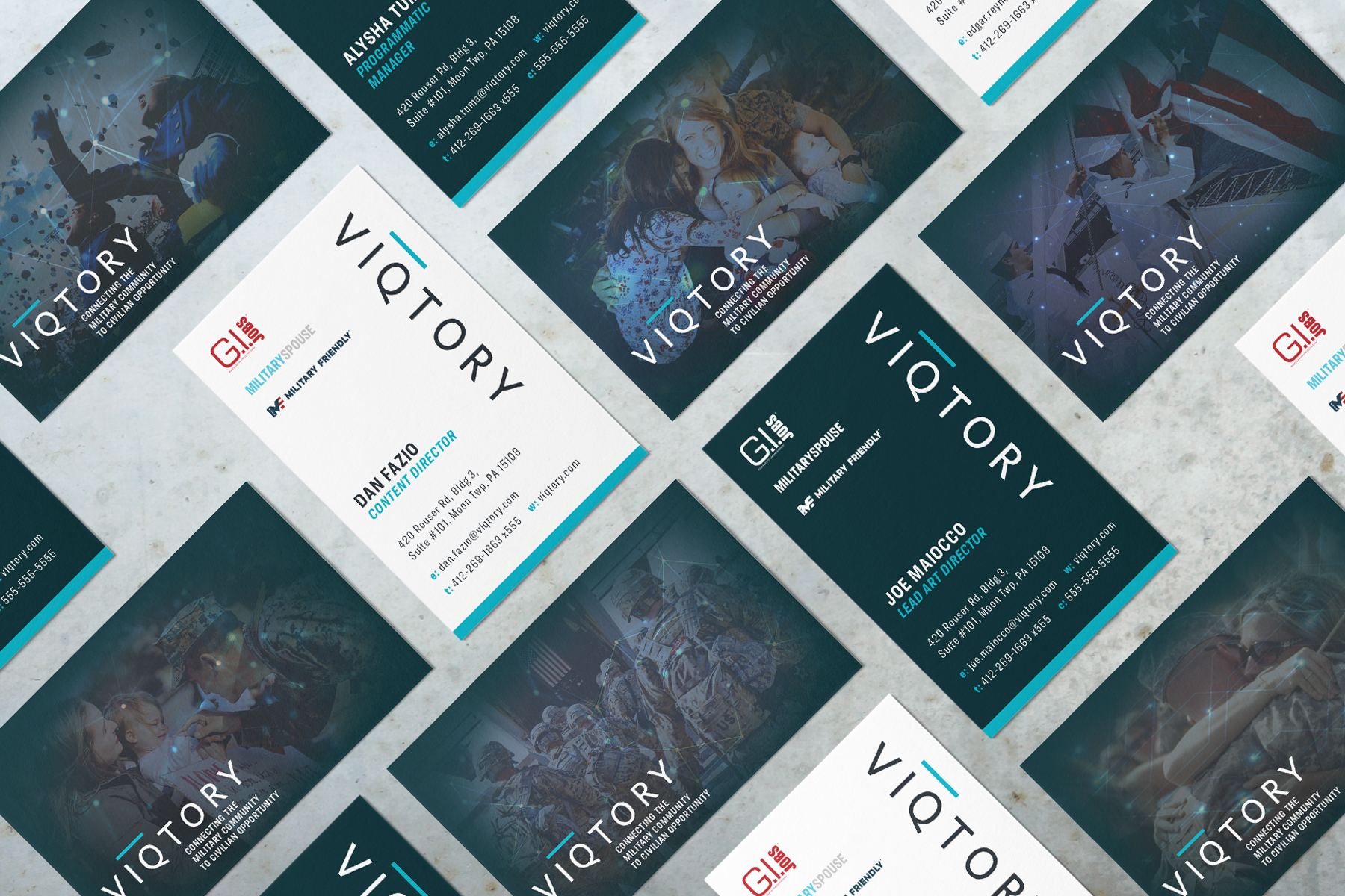
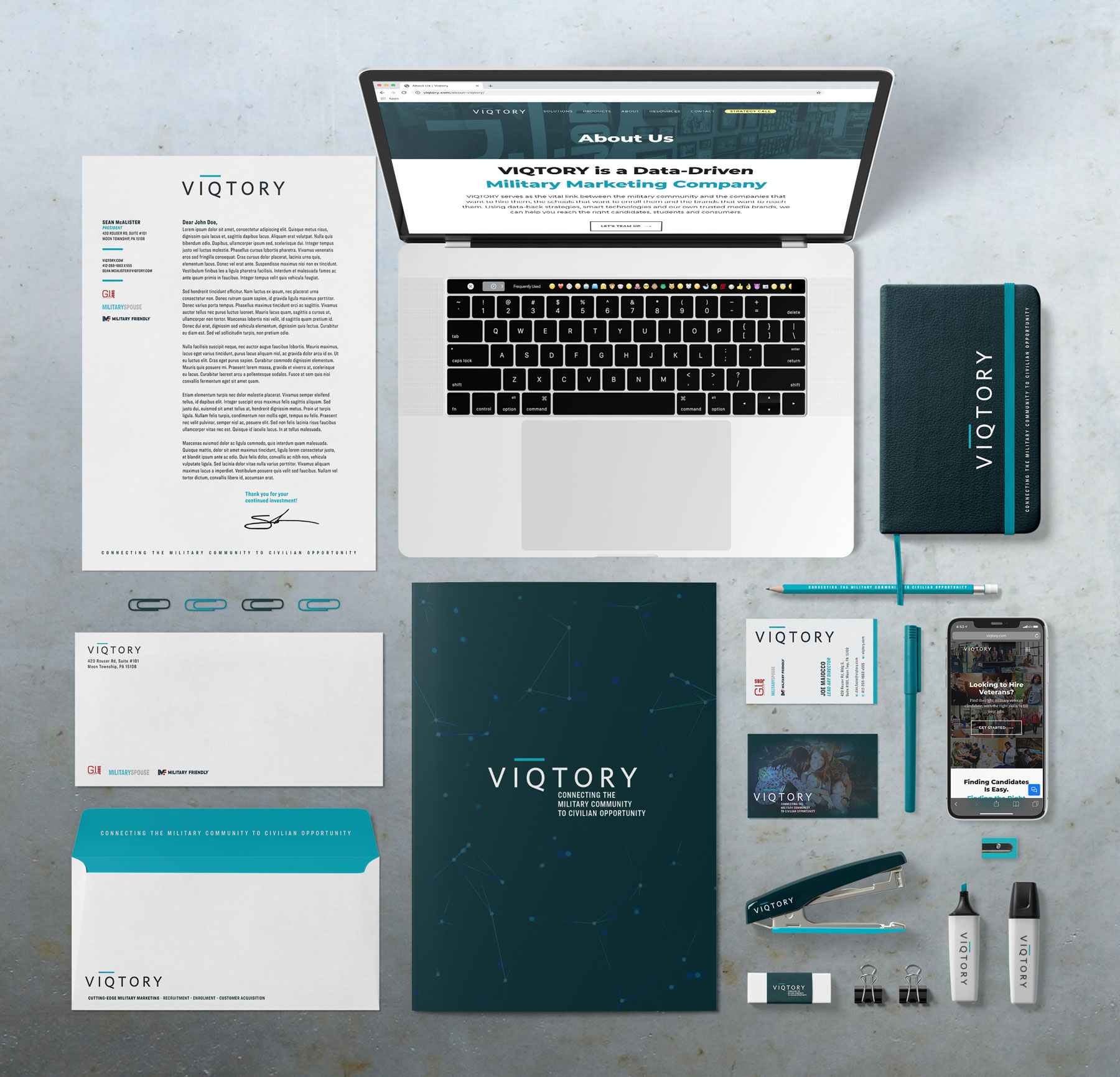
Business Cards
Our business cards had to be customizable. I developed a system that allowed each team member to pick either a white or stealth rendition for their contact information. Our sales reps requested to be able to write on the front. They also wanted the backs to vary since multiple reps would attend the same social events. We also added the three sub-brands of VIQTORY to the design, since most people don’t know that VIQTORY is the agency that runs each respective brand.
Stationary & Office Branding
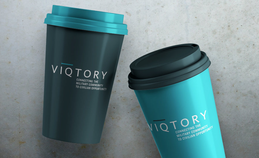
Bridging the gap between production and consumption.
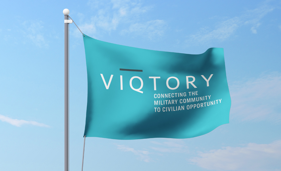
VIQTORY! (*Raise it*)
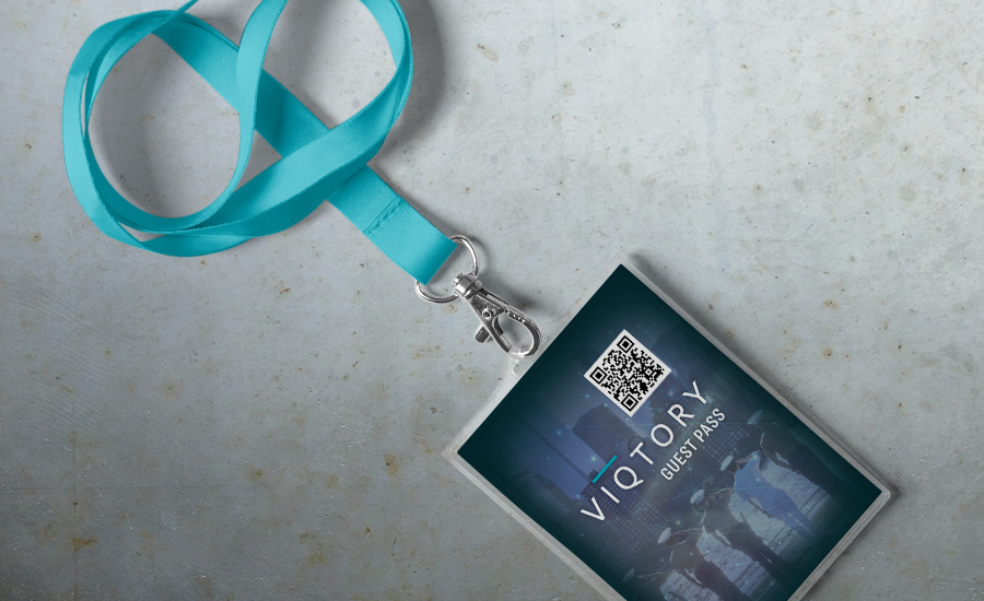
Sadly, our programmatic advertising efforts can’t get you reentry from a bathroom break. But this pass can!
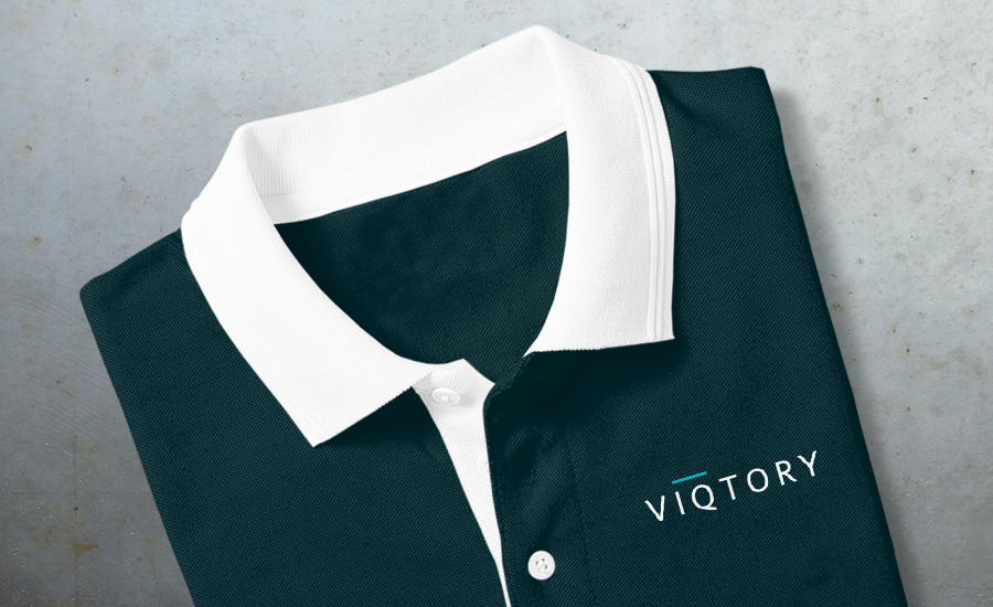
Dark, clean and simple are what employees want in corporate apparel designs.
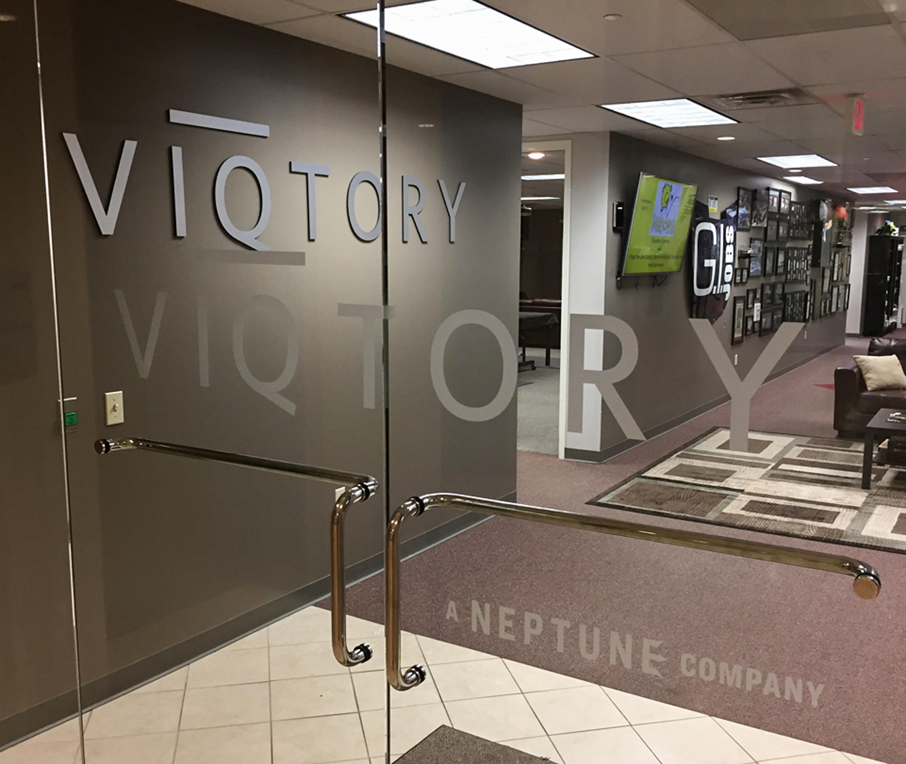
Interior Signage
I worked with a local vendor to install two variants of the logo. The first was a medal rendition of the logo on the entryway wall (installed for company photo opportunities). The second was a frosted version applied to the entryway glass doors. It was a blast to contribute to the installation of the pieces.
Does your company or business need to realign to gain the attention of your customers? I can help bridge that gap! Let’s get together and talk about a new vision.
© 2022 Maiocco Design Co.
Believe In Something Beautiful.